


Fidelitas Wines (Benton City, WA)
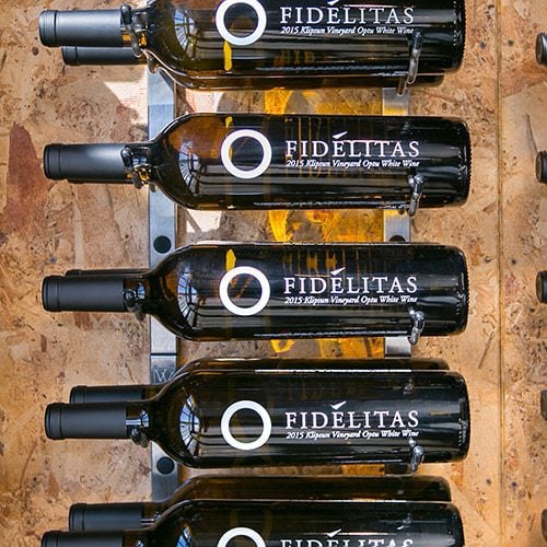
It’s not often we can take credit for helping rebrand a winery, but in this case, our wine racking is the primary reason the labels on Fidelitas Wines bottles look the way they do. Turns out, the fine wine producer in Eastern Washington fell in love with W Series racking to the point that it rotated its silk-screened bottle design for optimal legibility when stored. “You'll notice that our bottles are designed to be showcased on their side with the rack. In this case, it was the racks that drove the design of the bottle.” Jess Zander, former GM of Fidelitas.
Design Challenge
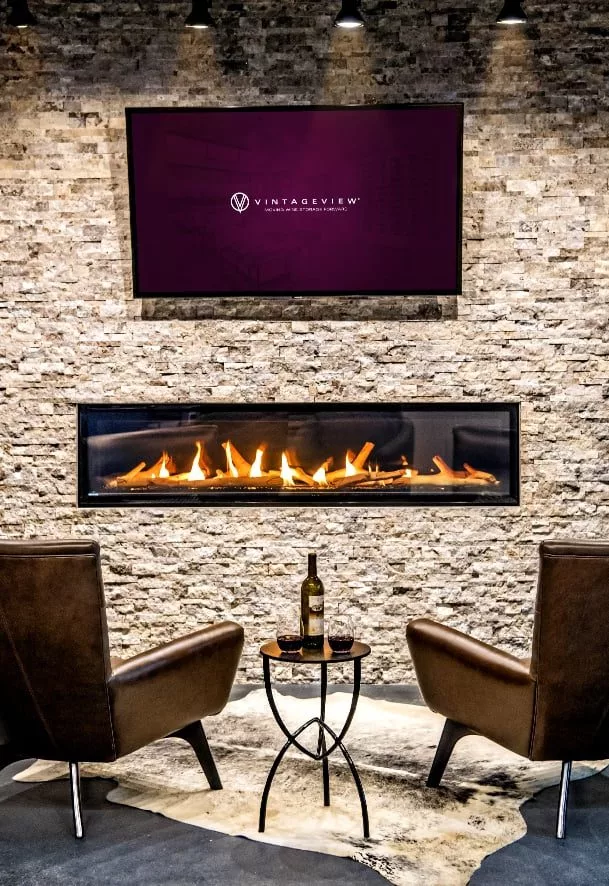
The brand is focused on simplicity. Make remarkable wine, package it in an elegant manner, and get it in the hands of oenophiles who appreciate a well-structured Washington-state wine. No additional frills needed. The tasting room (both at the Benton City production facility and the Woodinville tasting outpost) needed to enhance that mantra, giving tasters a place that emersed them in Fidelitas without being overbearing.
Designer Bio
-
Founded: 2002
-
Winemaker: Charlie Hobbs
-
Tasting Rooms: 2 (Red Mountain AVA & Woodinville)
The Solution
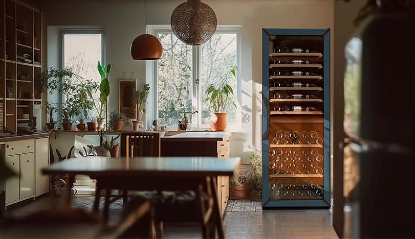
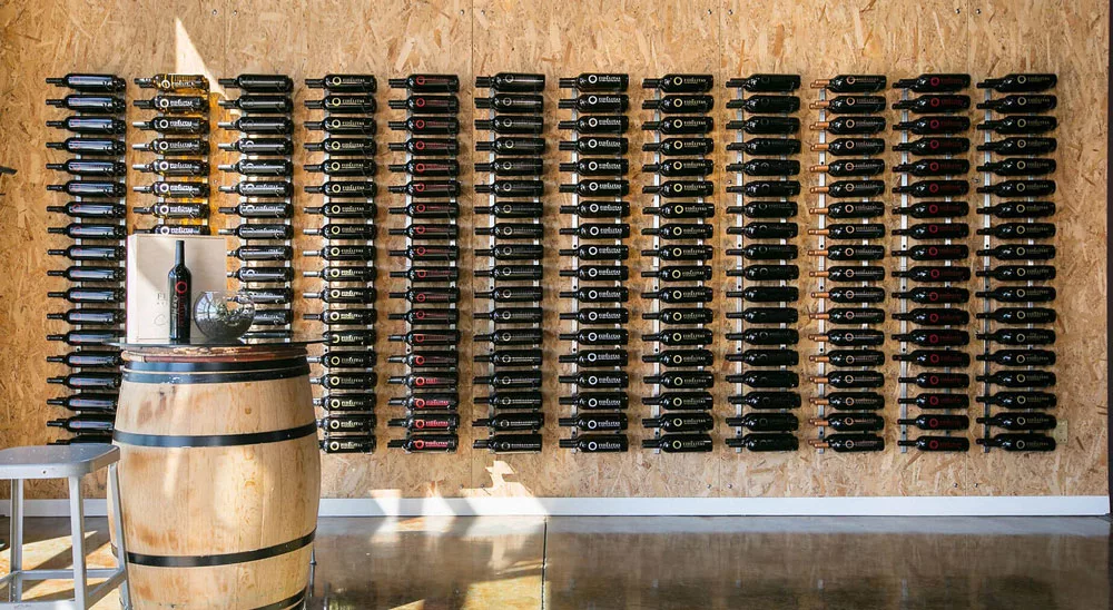
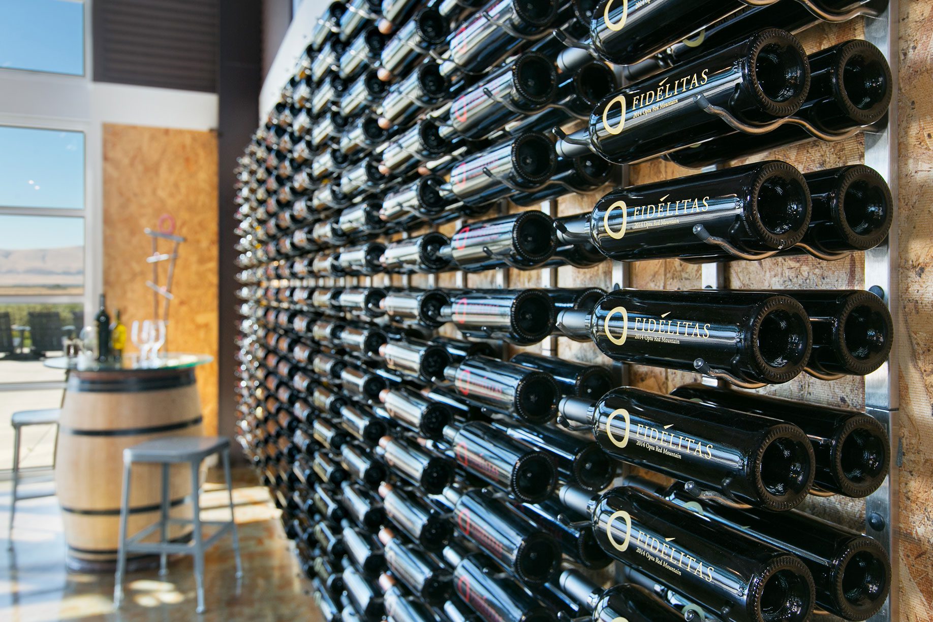
The winery lines the walls with OSB, giving the edges of both tasting rooms an industrial feel. The feature wall wine in the tasting area takes a balanced approach to capacity with triple-depth W Series wine racks, spaced with some room to visually breath. Aligned in simple, symmetrical columns, it draws the eye right to the bottles. In the climate-controlled library, the W Series is arranged in max capacity formation (holding more than 1,100 bottles alone), stretching about 13’ from the floor, with a Presentation Row inserted to break up the columns.
Design Approach
Minimalism. The silk-screened bottle exudes that principle. So does the casual elegance of the tasting area. The simple design allows Fidelitas to organize its color-coded labels (each wine style has its own color) to foster brand engagement and customer enjoyment.
All photos by Nic Aston