Aug 22, 2017
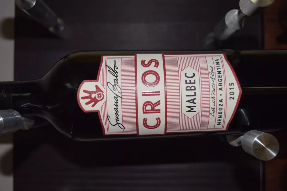
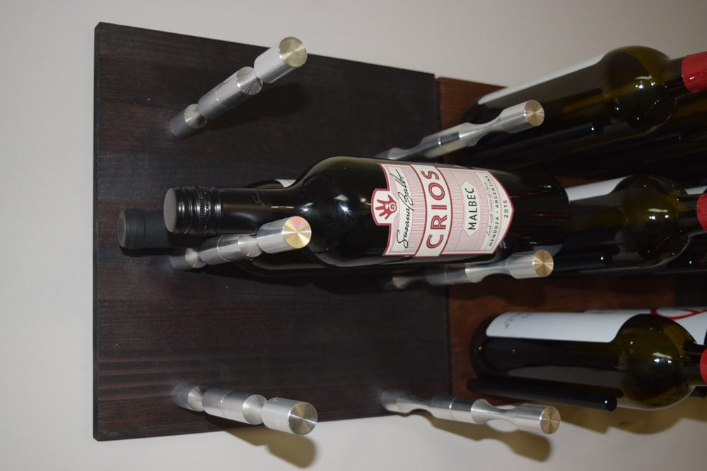
The Susana Balbo “Crios” Malbec label is a crisp take on the art deco style. Simple fonts and straight, bold red lines give it enough design structure and pizazz to stand out on the shelf. Then there’s the handprint, which, in previous vintages, was a dominant visual centerpiece. Now it’s a fun secondary element.
The combination brings a playful, yet structured impression to the wine. Nothing old school about this bottle. And little in Argentina is that old when it comes to wine world prestige, the design makes sense.
- Picking by Label: We pick a wine bottle based only on its label — then decide if it tastes as good as it looks.
So when we opened this red from Mendoza, one of our favorite mountain regions of the world,, we had high hopes of fruit forward flavors that would allow this to drink well on its own — alongside some structure that would allow it to live in the serious world of wine.
Basically, the label told us this was modern interpretation of a classic, Old World wine grape that was originally brought to market as a blending grape in many great Bordeauxs.
Did it live up to expectations?
While we enjoyed sipping on this wine, it only showcased half of what we were seeking: the structure. This came in the form of a dominant oak flavor profile that possibly overshadowed the fun we were hoping on plum and berry side of the wine. So no, at least not yet.
Aging Potential
A little more time in bottle should mellow the oak tannins and give the fruit some more room to roam on the palate. Store it on your Grain + Rod metal and wood fused wine panel for a few months. $13.99
Why did you pick this wine?
“I picked this label for the art deco design” — Laura Gonzalez, Dealer Guru


